Boeing Sustainability
Touch Table

Charting a course for sustainable aviation
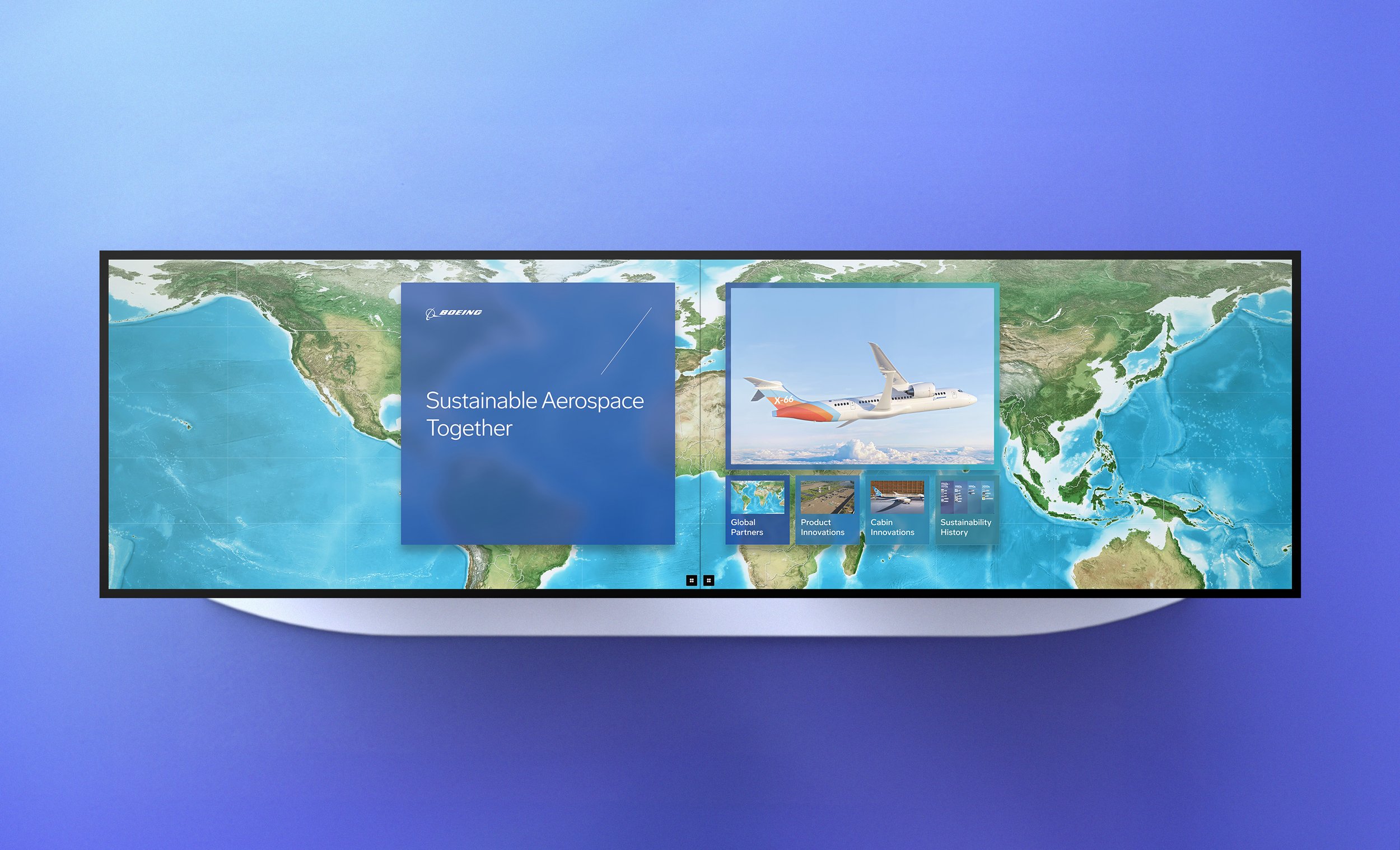
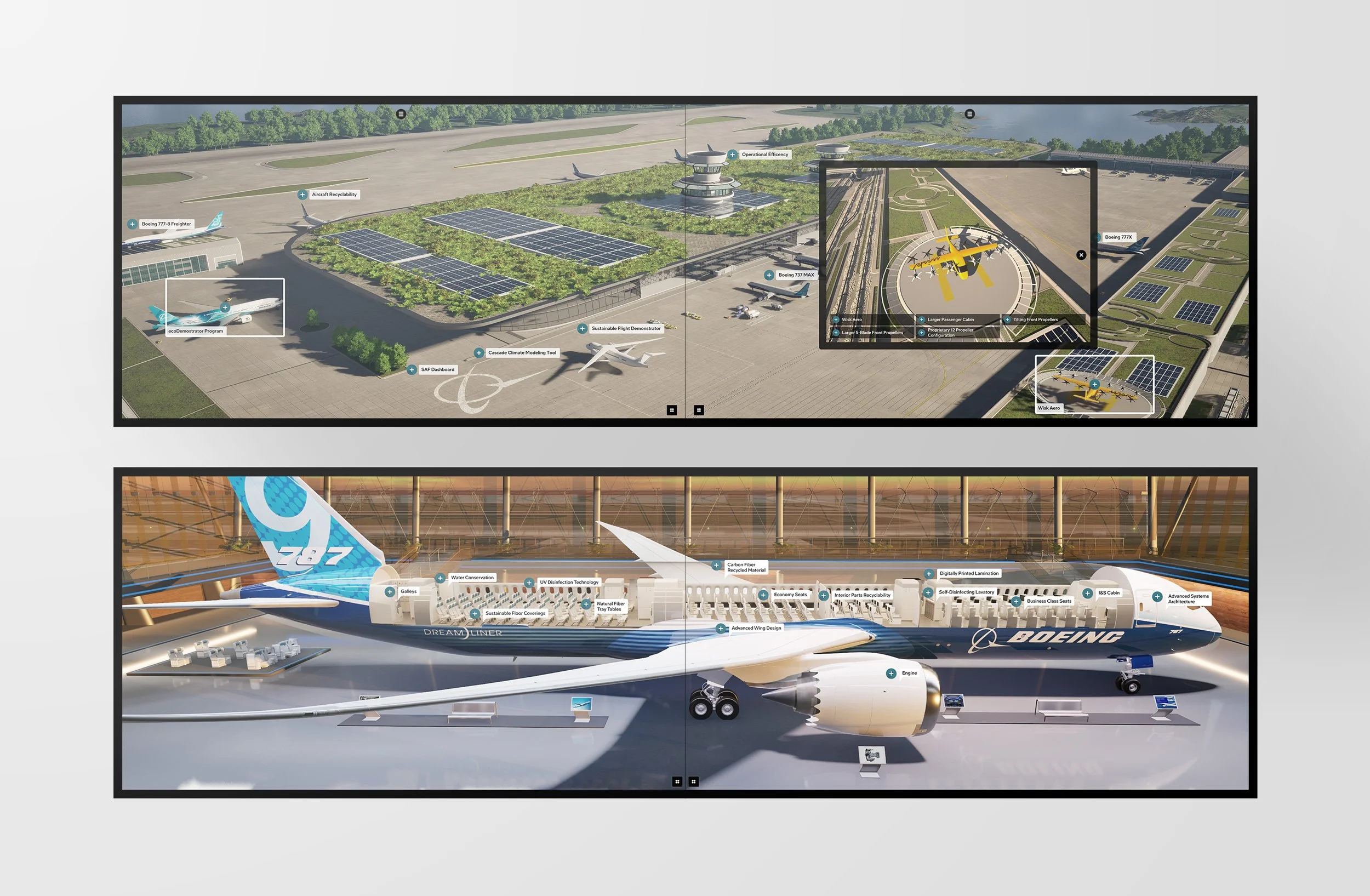
Boeing needed a way to make its sustainability strategy tangible for aviation professionals at trade shows. As Creative Director, I led the redesign of an interactive touch-table experience, using animated 3D worlds to walk visitors through Boeing's approach to sustainable aviation.
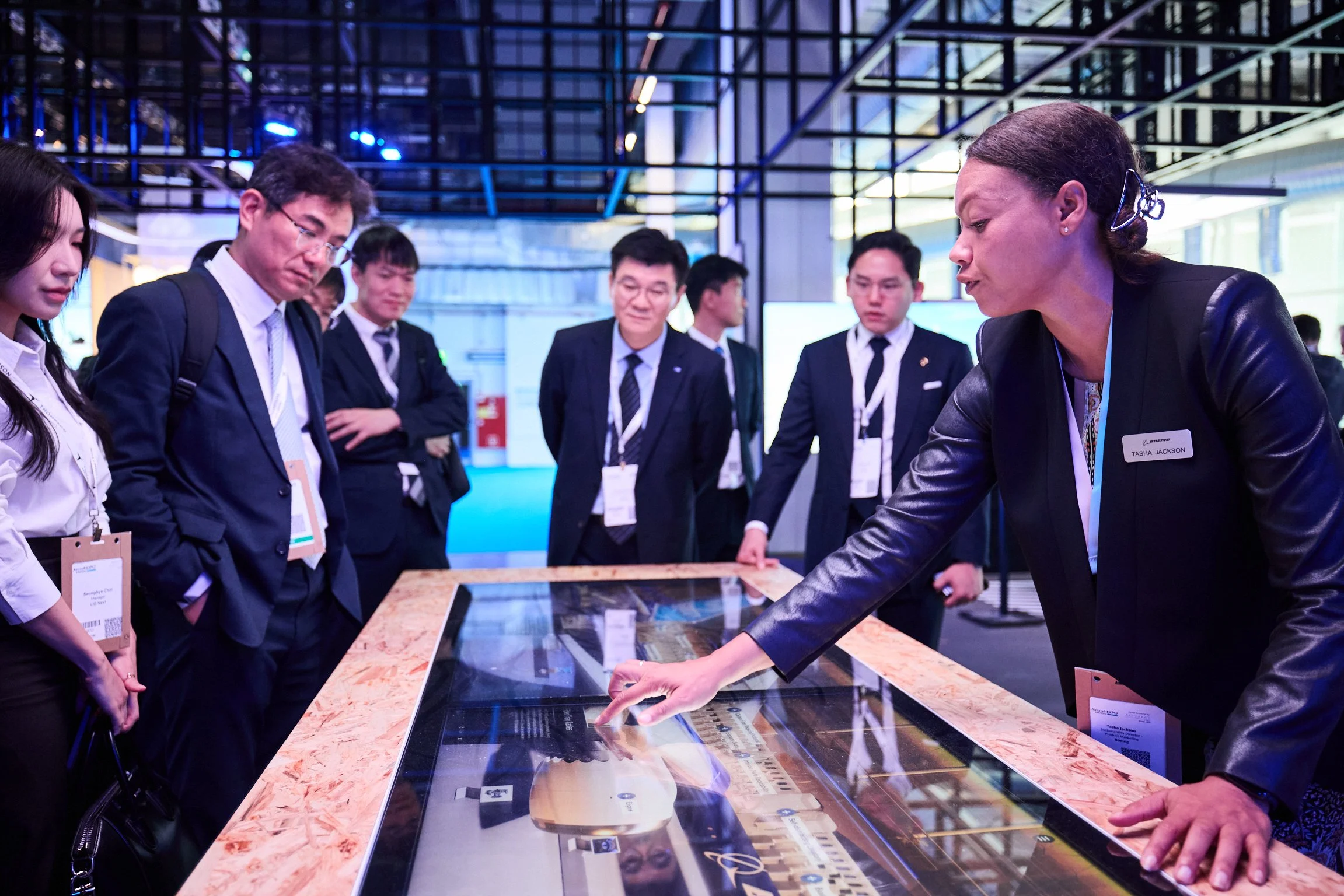
The experience was built around human-centered design principles to ensure accessibility for a wide range of users, supporting both self-guided exploration and docent-led presentations.
My role
Creative Direction
UI + UX
Agency
Teague

DISCOVERYWhere there previous version fell short
We began the redesign by evaluating the first iteration of the touch table, gathering feedback directly from Boeing's product marketing team.
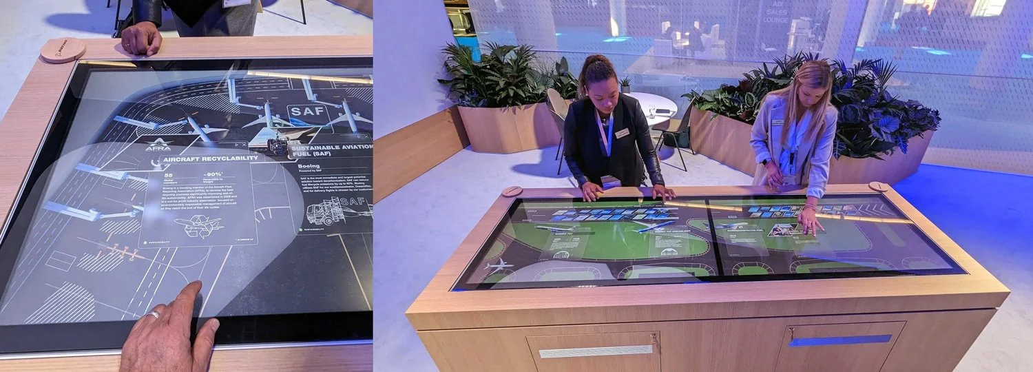
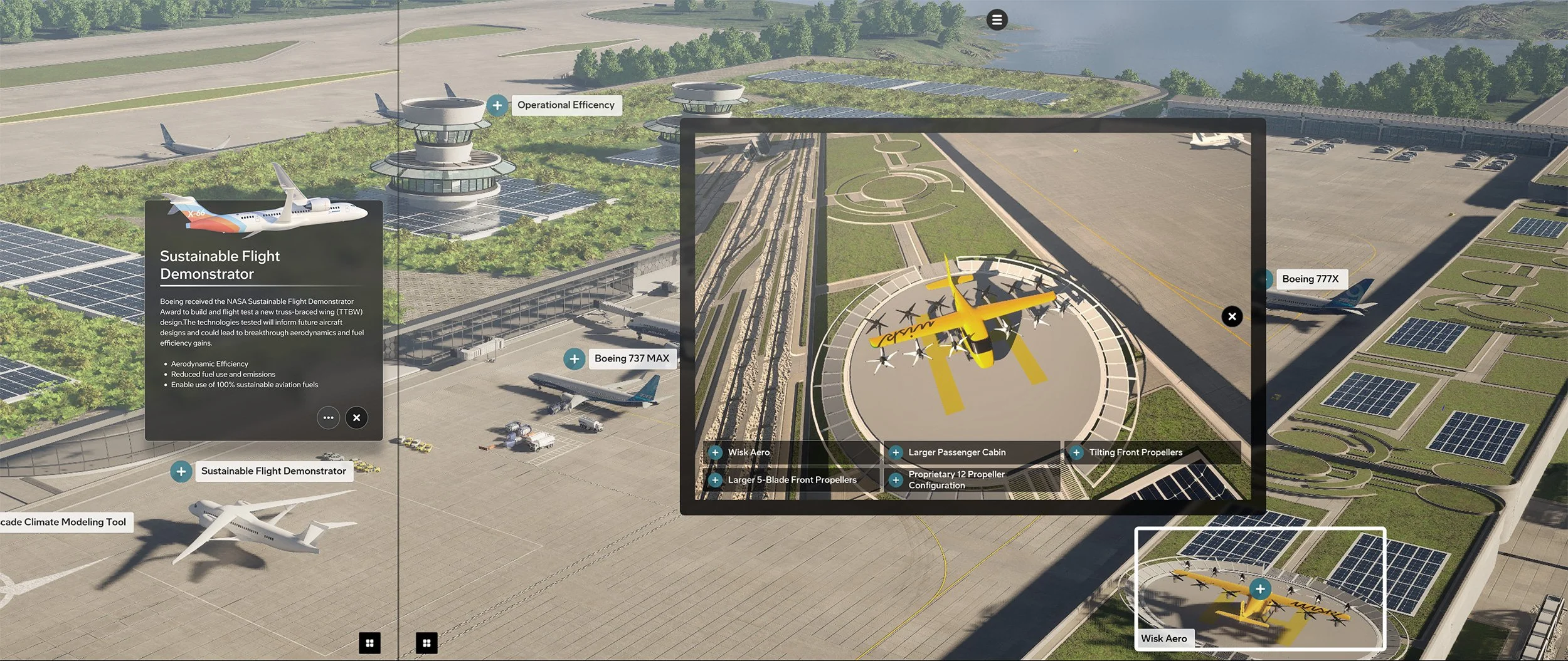
Previous kiosk design: detail and context
Three goals for the redesign
Simplify window management
Customers often opened multiple points of interest at once, cluttering the screen — and each window had to be closed individually or left to time out.
Improve accessibility
Contrast ratios and touch reachability fell short for a broad range of users.
Elevate the visual experience
Early visuals didn't fully land, and the pop-up card layout felt busy and disorganized, making information hard to scan.
HUMAN FACTORS STUDYMapping reach across every user
I began by working with our human factors team to identify which areas of the table were reachable and visible across a range of body types, heights, and mobility needs — from a 95th-percentile standing user to a 5th-percentile wheelchair user. Reach zones varied significantly between standing and seated users, with the middle and bottom bands emerging as the most accessible for both.
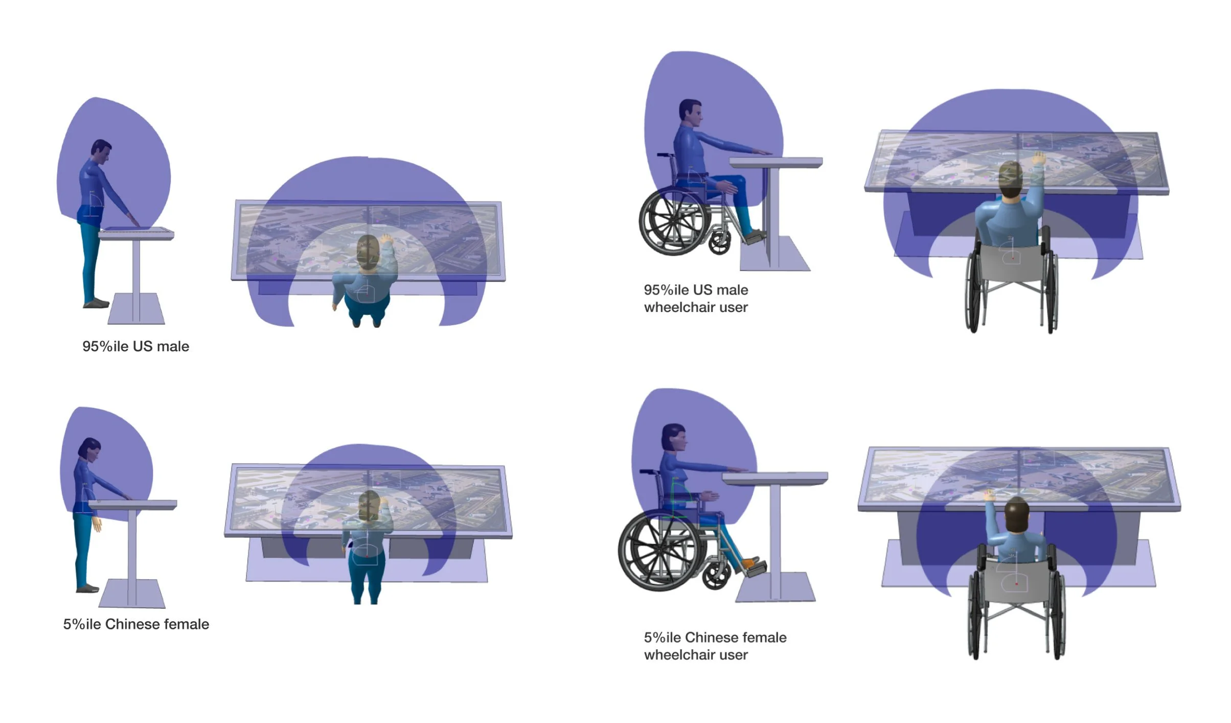
Diagrams of human factors research showing reach for standing and seated users.
Keep key content in the middle and bottom bands
These zones are the most accessible for both standing and seated users, so interactions and information should live within them whenever possible.
WINDOWING UXSolving for clutter,
one window at a time
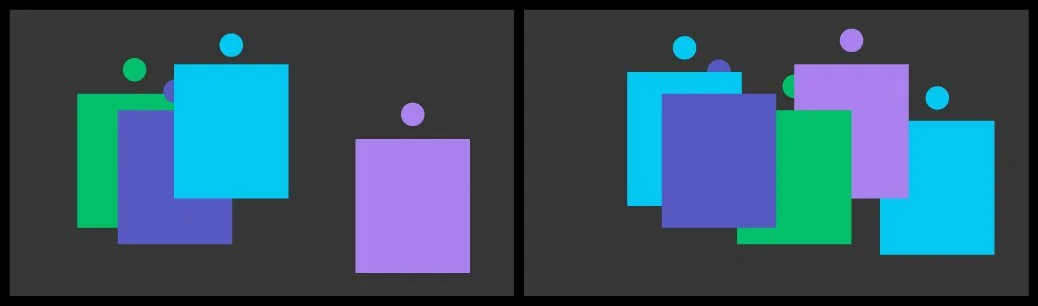
In the previous version, windows could pop up anywhere on the screen with no clear structure, quickly turning the table into a busy, cluttered mess.
We rebuilt the windowing model to give presenters more control, so they could spend less time managing windows and stay focused on the conversation.
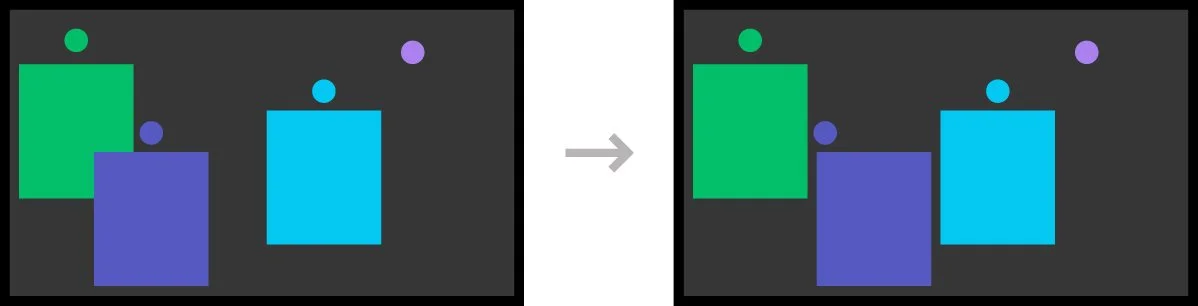
Pop-ups now snap to an established grid.
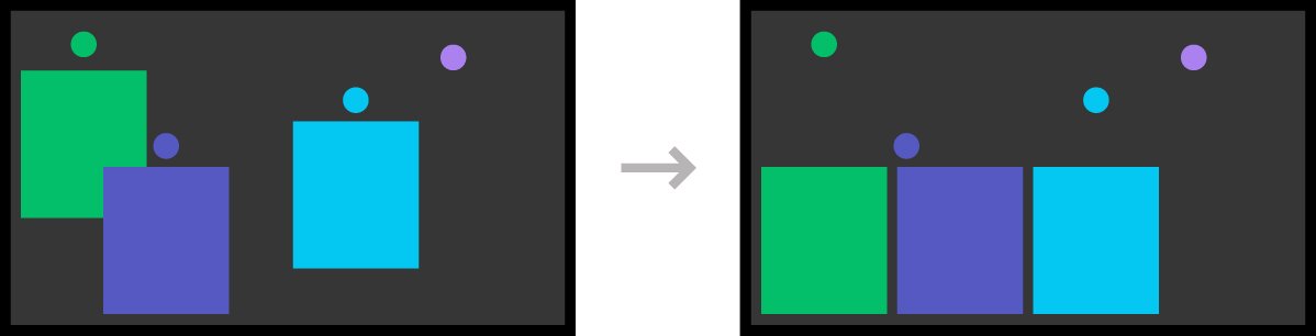
Pop-ups position at the middle/bottom of the screen for improved accessibility.
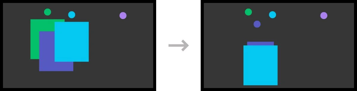
Pop ups stack to prevent clutter.
Two max in a stack.
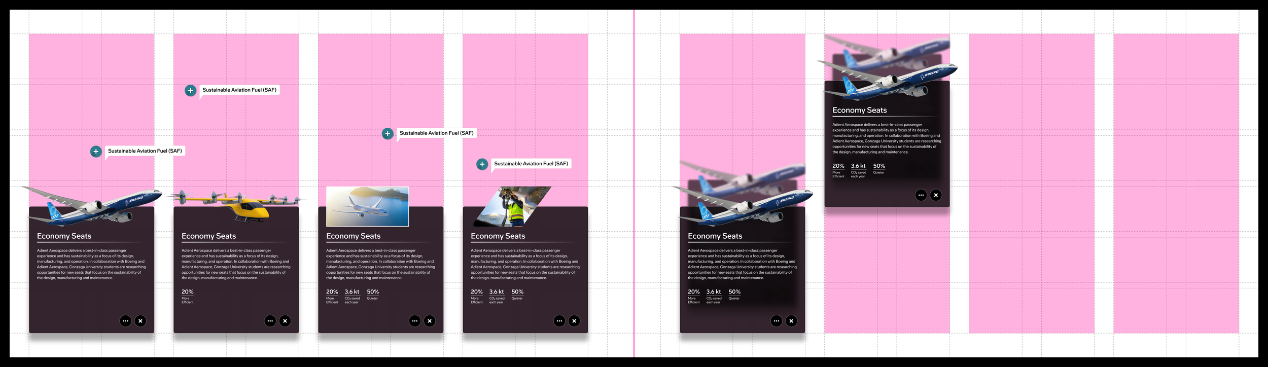
Applied grid system and stacking behavior.
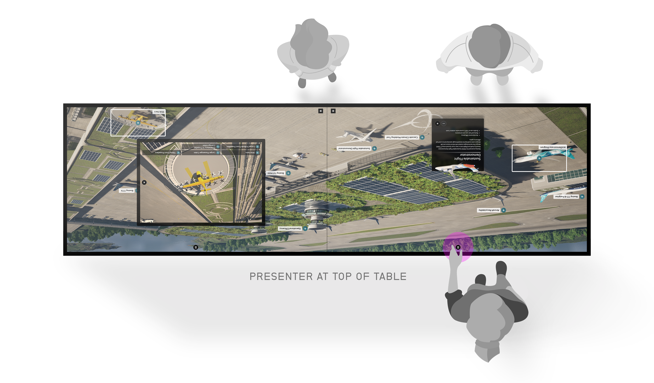
CUSTOM PRESENTER MENUA contextual menu, right side up
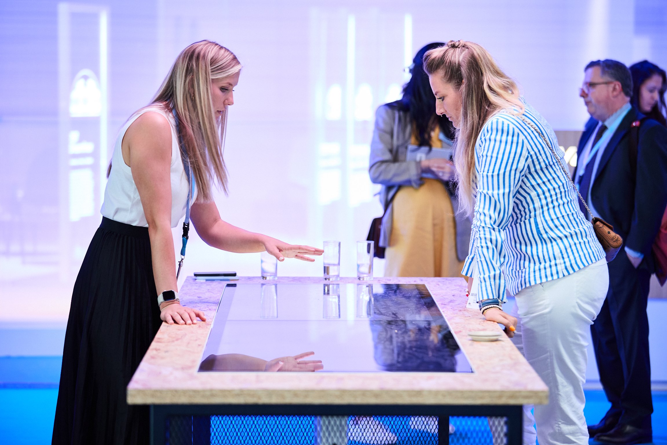
Presenters typically stood at the top of the table, so we gave them their own menu, oriented to their perspective. It puts navigation and window controls right where they're standing, so they can more easily manage the screen and the conversation.
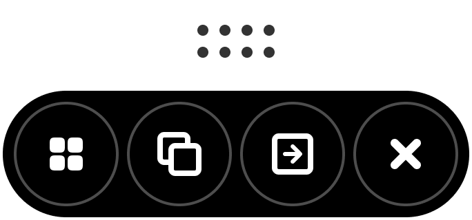
Window Controls
Reposition window, duplicate, send to other screen, close

Global Navigation
Ability to switch other scenes and homescreen